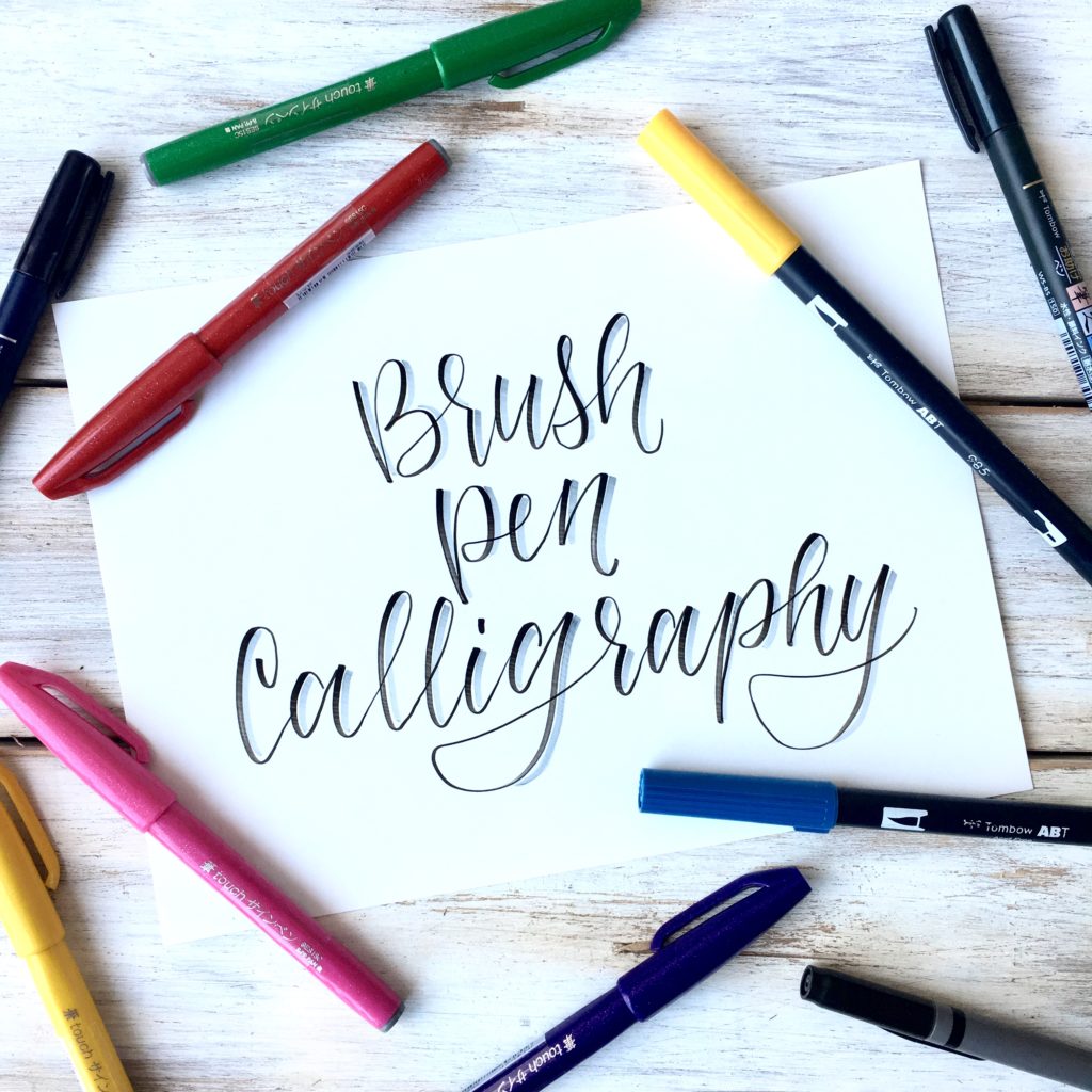
Alrighty friend, this post is a doozy. All about getting started with brush pen calligraphy. Before we get going I want to point out that I created a free printable practice sheet for you to have! Just click here to download.
Brush pen calligraphy has been taking the world by storm lately! And for good reason! Brush pens are so fun because you can create a huge variety of lettering styles with just one pen! (If you have seen my post on 10 easy hand lettering styles, every one of those styles can be done by using only a brush pen! ) They also don’t leave much of a mess, and generally are pretty easy to learn to work with!

It really is a fun skill to learn because it can push your art to the next level. For example, learning brush lettering has completely changed the way I do Bible journaling. Before, I would only apply some basic watercolor and write the key verse down in my normal handwriting. Not that there is anything wrong with that. But now I use brush calligraphy, or brush lettering, in 99.9% of my Bible journaling pages, and I just feel a bit prouder of my page by doing so. I know that God thinks every page I do, no matter what it looks like, is beautiful -because it’s a reflecting of my love for him and his word- But we all want to make our art as pretty as possible right?
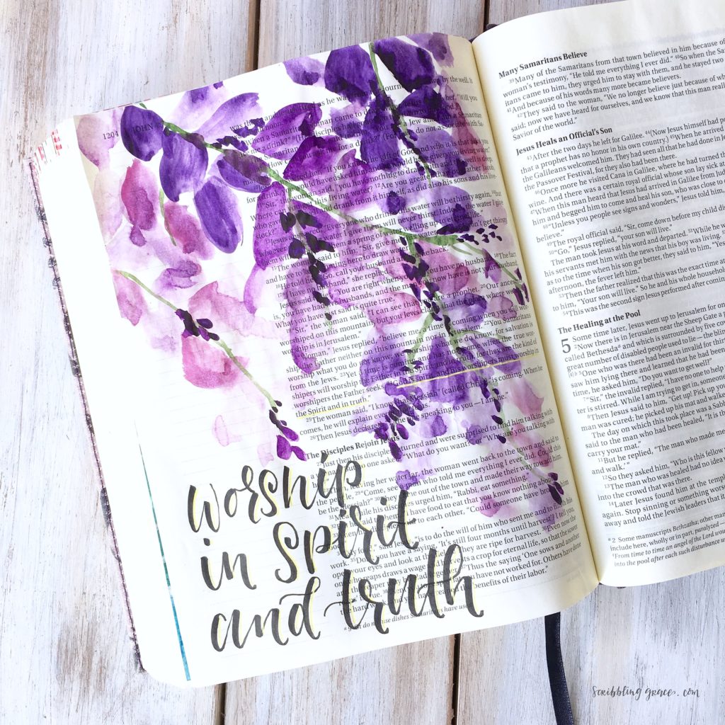
So I thought it about time that I give you a basic overview of what brush pen calligraphy is and how to do it!
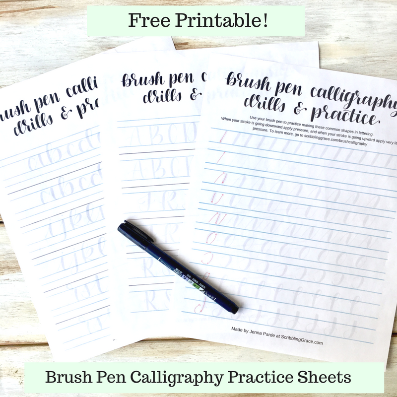
I also have free calligraphy worksheets for you to have! Use them to practice useful shapes and the alphabet in both uppercase and lowercase! So go ahead and click here or on the image below and print those out! – If you decide to use them and post it on Instagram, tag me so I can see! I’d love to see your work- @scribblinggrace.
I think that it is easier to both show, and learn, how to do brush calligraphy through a visual, so I made a video! But I know sometimes I need the steps in writing as well, so feel free to keep scrolling to learn more!
A brush pen is essentially a marker with a bendy tip. Some brush pens have bristles like a paint brush, but most have a felt tip (like a normal marker). I personally prefer the felt-tipped ones, but that could be a fun thing to play around with!
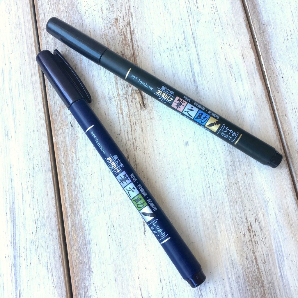
Perhaps the favorite among all brush calligraphers, and the most recommended brush pen for beginners, is the Tombow Fudenosuke Brush pens. I have talked about them before in my post on “Best Pens for Bible Journaling” but I really just can’t rave about this pen enough. You can get a pack here on Amazon (affiliate link) That has both the hard tip and soft tip Fudenosuke. The two tips are basically the same, just the tip of the soft tip is more bendy so it can create slightly larger downstrokes (I’ll get to what downstrokes are in a second…) The soft tip can be a little harder to control for some, so I usually recommend starting with the hard tip. Or just try both ;).
Bonus- the Tombow Fudenosuke also does not bleed through Journaling Bible pages and it is waterproof!
There’s a bunch of other really great brush pens as well, such as Pentel Touch brush pens and Tombow Dual brush pens which come in a bunch of different colors. These, however, are not the best for Bible journaling as they tend to bleed through an unprepared page. They are also not waterproof.
I recommend starting out with the Fudenosuke and then as you get more comfortable with the technique, branching out and trying other types of brush pens. The three I mentioned are just a very few out of the available options out there in stores.
Before you get started you need to understand the foundation of calligraphy and what it is. There are 3 types of calligraphy:
Faux calligraphy– Which I have a tutorial on here and definitely recommend starting with; as you don’t need any fancy supplies, just a normal pen.
Brush pen calligraphy– Which we are talking about today
Dip-pen calligraphy– This is the original and traditional form of calligraphy, using a nib and ink. As the name suggests, you dip your nib into the ink to write with. This is how I started learning calligraphy, and while it is beautiful, it is not the most practical and is quite difficult to get the hang of. It also doesn’t work too well in Bible journaling, as you could imagine.
They are all fairly self-explanatory.
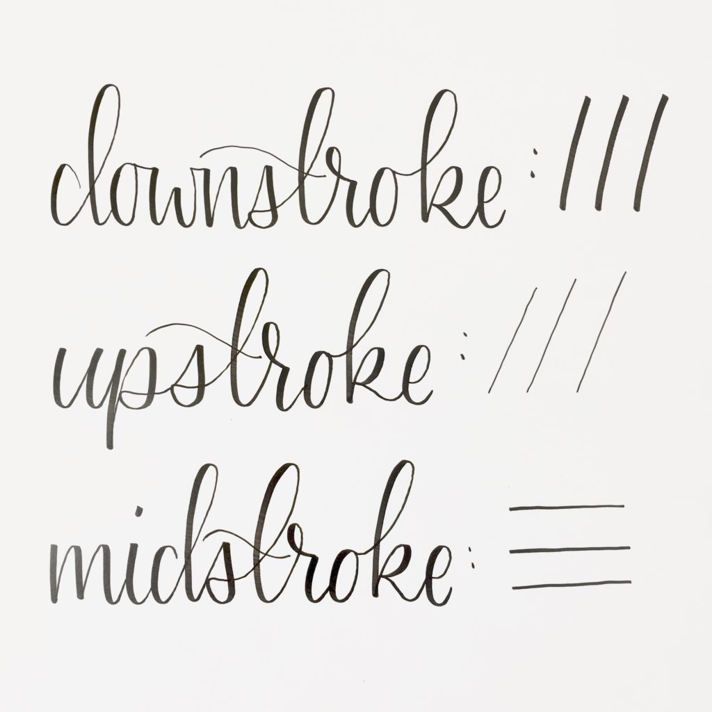
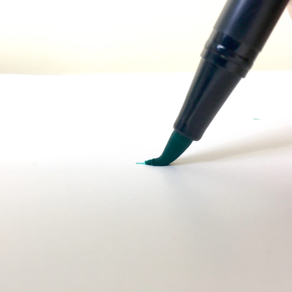
–The downstroke is the most important. It is when your pen is gliding downward. The key is that the downstroke is thicker than the rest. In faux calligraphy, this thicker downstroke is created by manually thickening it up after writing the letter. But in brush pen or dip pen calligraphy, this downstroke is created by applying pressure to you pen when going downward.
–The upstroke is, of course, when your stroke is going upward. For this stroke, you only want to apply just enough pressure that the tip of your pen touches the paper. You want to keep it as thin as possible! This creates that beautiful look of the thin upstrokes and thick downstrokes that calligraphy is all about.
–The midstroke would be like the crossbar in the “t” or “H” this one is usually kept pretty thin but does not matter so much as the other strokes.
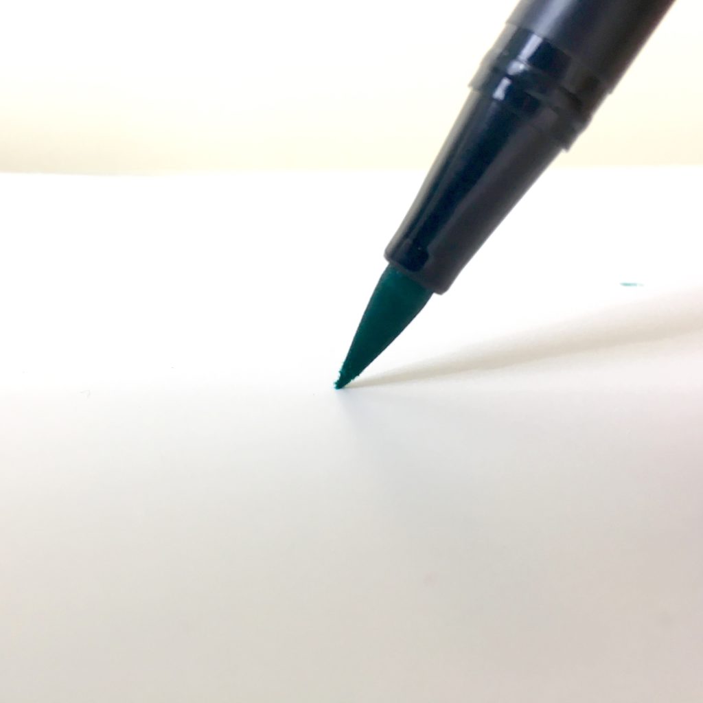
It sounds simple! And really it is, It just takes some practice to get a hang of it.
I suggest trying it out using the free worksheets I made. On the first page, there are common shapes that are used to form letters. When you see the arrow on my example going down, push on that pen! When you see the arrow going up, try to see how tiny you can make that line.
Let me know in the comments below if you have any questions or comments!
Also, be sure not to miss out on the free printable worksheets, and watch the video to go along with this post if you need to see it in action.